I absolutely love the poster (probably just a digital poster, I guess) that somebody put together for the farewell event for Matthews Auditorium (Princeton's soon-to-be-demolished high school theater.)
Somebody really did a creative number on the Viking head that we use for our logo (and that the we pretty clearly stole from the Minnesota Vikings or a thousand other logo sources.)
With all that being said, I am a little curious as to how this fits into the Princeton branding guidelines that say "Do not distort the master brand logo" and 'Do not put the master brand logo in a box or any other shape" because this is clearly being promoted officially by the school.
Showing posts with label design. Show all posts
December 12, 2014
September 17, 2014
The freakiest of trees
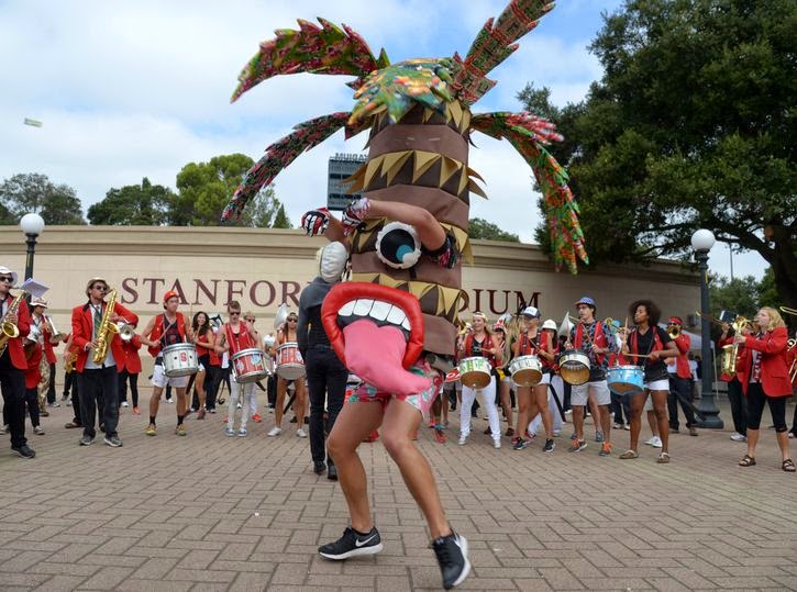
The Stanford Tree has gotten even freakier this year.
And I love it...
...love it a whole, whole bunch.
The tongue, the flowered shorts, the gloves, the multi-colored palm tree leaves.
It's spectacular.
Not that the past ones haven't been awesome, though.
I especially dig the gold tree, the red tree, and the one that's mostly trunk just above the red tree.
Love the weirdness.
Tags:
chucklesome,
design,
sports
September 3, 2014
Protecting the brand
So...
I remember back when I stepped into the PHS website management business a couple of years ago, I posted a couple of posts about what I saw to be the needs of PCSD in the digital realm - consistent branding, centralization of design, elimination of non- or quasi-official web presences (Twitter, Facebook, Instagram, etc) - and before that, as the district was transitioning to SchoolWorld's web management and hosting, I asked about things like a standard font, a style guide for the website.
(There, I'm finished patting myself on the back and saying "I told you so." I promise not to do it again for the full duration of this post.)
This summer the Princeton City School District adopted branding guidelines that included print media guidelines (fonts, logos, letterheads, slogans) and digital media guidelines (fonts, logos, specific account names and access). I finally got around to reading the guidelines, and I thought I would offer up my thoughts...because...um...it's my blog, I guess.
- I appreciate the definition of the brand...celebrating diversity, pushing our students, joining the students & staff as 'learners.' I'll admit that I have no idea how this brand platform is reflected in the various choices made further along in the guidelines, but it's important to define who/what you are so that everything can come back to reflect that.
- I don't get the Modern Nostalgia thing, admittedly. History, Purpose, Identity, and Destiny, either.
- The Viking of choice - white horns, red back flap, grey band - is clearly the right choice. I miss the three-dimensional character and high-resolution nature of some of the Vikings, but the one they chose is a solid choice.
- I don't care for the "single color (all scarlet) to be used for athletic branding" option, and I'm not sure what 'athletic branding' really is. I assume that the four-color Viking will still be seen on athletic things like the gym floor.
- Interestingly, the floor in the auxiliary gym of the new high school has the grey-horned logo about twenty feet across on the floor. Maybe should have come up with this plan before painting the floor.
- Also interesting that the Viking is always straight level not tilted slightly upward. This isn't address anywhere in the branding brochure, but there are a lot of Princeton things where the Viking is at a tilt.
- The hat that I'm currently wearing (shown on the left) has the wrong logo in at least three ways: wrong horns, helmet band, back flap colors. It wasn't printed by Princeton but rather by a hat shop in Tri-County Mall back in the days before Princeton had a spirit shop in its most recent incarnation. The other hat I have was made by Princeton a few years back and is the right Viking.
- The thoroughness of the logo presentation - on white background, on colored background - is appreciated.
- I'll miss the LHF Brewers Bold font in the Princeton City Schools logo. The Proxima Nova Condensed font is more contemporary but lacks elegance. I also don't like the kerning on the logo.
- The two-color oval is interesting. I can't see it large enough to see if the red fades to grey or if it changes immediately. It also seems to have a lot of white space between the central logo and the oval. Interesting choice to do that.
- The secondary logos - the crests - are very interesting. They're the only place with the Viking ship and the P encircled logos. They're also transparent which none of the other logos are. Again, an interesting choice to do that. It makes the logo as displayed in the center on that slide (the PCMS logo) very hard to read against the light grey portion of the photo background.
- I still find it hilarious that the Little Vikes logo, a pretty blatant copy of the old Cleveland State logo, is still around.
- I never knew there was an athletic hall of fame logo.
- I've always hated the flying "P" logo, and I'm happy to see it go. The Viking horn as the top of the P was interesting, but the P always looked squat and deformed to me. I'm sorry to see that the Princeton Education Foundation would still be using it.
- There's no definition of Princeton red or scarlet in a web color. It's R187 G0 B0, but no idea in hex what that is. I'm sure I can find out, but it's an oversight. Same with the gray.
- Why, my that's a lot of different, approved fonts. Why is Trajan Pro there?
- Interestingly, the font on the New Social Network Communication Plan slide isn't one of the approved fonts.
- Only having one Princeton FB page is going to get, I would think, crowded with too many individual school postings.
- The email signature is hilariously long, and I hate but understand the supposed need for the confidentiality notice. I doubt it would have much legal standing with the ease with which email is forwardable, but I understand it. I'm using it, though I've seen lots of modifications (color changes, font size changes) to other people's signatures at school. Interestingly, if I reply to someone, the signature is automatically included, but if they've used some font other than arial, my signature changes to their font. I don't know what's up with that.
- The 24/7 Princeton Pride slogan lives. It's fascinating to me that the 24/7 - which came from the football numbers of two players who died during their Princeton years - is still around and has morphed into something used all the time.
- I'm sorry to see 'Go Vikes' not being acceptable anymore.
- The letterhead with the watermark Dream Achieve is actually kind of attractive. I like it and wonder when we'll get a chance to use it ourselves. I'm still using letterhead from a decade ago and just keep updating the principals' names.
- I wonder if the Gary Pack business cards were real creations or digital ones. I don't understand some of the letters there. T=telephone...M=??...W=email?...A=address
- I'm surprised that the city is listed on the business cards as Cincinnati instead of Sharonville where the central office actually is.
- Dr Pack is leaving us in a couple of weeks (but staying as a consultant for a year and a few months beyond that). I wonder if he has to turn in his business cards if they do exist in meatspace.
- I find the background of the sample brochure hard to read.
The sell is going to be, I'm afraid, tough. Teachers are fiercely independent, wanting to use their favorite little graphic, their favorite font, their favorite font color, their favorite colors. I wish the branding police a lot of luck, persistence, and patience, because they're going to need all three, I'm afraid.
August 1, 2014
Branding the Vikings
I noticed last week that the Princeton High School Facebook page has gone through a bit of rebranding, switching the profile pic from being a Viking to being a PCSD logo and changing the name of the page from PHS to PCSD. The banner pic also changed, though I'll admit I have no idea what it was before it became the image of the new school.
There was also a story posted on the page linking to an Enquirer story announcing that the Board of Ed had decided - after Shawn McMullen's presentation - that the Viking's horns should be white. That isn't, admittedly, Earth-shaking decision making - especially in light of a year when 25% of the high school's certified staff left the building over the summer. It is, however, something that I'm somewhat happy about.
See, I've been noticing the lack of coherent branding in the district for a few years now. Below the jump you'll see some pictures that I had a couple of my student aides take in 2007 and 2009 showing how many different ways the Princeton Viking was being represented around the building, a building that now is going to be plowed under within the next year.
I'm curious to see font choices, manual, colors, and letters that Shawn has chosen...
Shawn McMullen, media and tech specialist for Princeton City Schools, gathered the district’s logos and narrowed the fonts and colors, and designed letterhead to reflect a consistent use of design to identify the school district.
The district’s logos include a flying letter P, a youth version of a Little Vike, and a single horn. Each has a purpose, and McMullen outlined the use for each in a manual that he is compiling.
June 25, 2014
Let's play the alphabet game
Threadless has a t-shirt for sale with the following design, an alphabet of male musicians...
Let's see how many I can name.
Tags:
alphabet game,
commerce,
design,
music
June 11, 2014
The dome's never looked so good
My summer job is traveling the country presenting week-long workshops for teachers (primarily science teachers) on behalf of the ASM Materials Educational Foundation. As such, I get to spend a couple of April days at the ASM headquarters in Materials Park, OH in a southeastern suburb (or maybe exurb, I'm not familiar with the area) of Cleveland.
This year we were up there just after ASM had announced their new logo. You can see it in the video up above, but here's a still of it...
It's a needed update from their older logo...
...and gives them an opportunity for some new branding, such as in their six posters that we were able to see sitting in the dome's employee lunch area...
None were ready for production while we were there. I know, because I asked. I particularly love that second one, with the tagline "Make big plans!" referencing a quote by architect Daniel Hudson Burnham:
Make no little plans; they have no magic to stir men's blood and probably themselves will not be realized. Make big plans; aim high in hope and work.It's a quote that is engraved on the Eisenman Fountain underneath the geodesic dome that rises above the ASM headquarters - and referenced in an editorial from Michael Connelly, one of the ASM trustees.
If you're ever in the area, stop by and check out the dome. It's a sight to see.
April 16, 2014
Awesome chemistry posters
Simon Page put together some posters for the 2011 'International Year of Chemistry'. Three of the prints are for sale on his online store, but they're prohibitively expensive (£55).
The rest of his posters are pretty gorgeous, too, with nice colors and geometric designs.
The other awesome chemistry posters I want to mention today are from Compound Interest and are way more informative than Page's. They aren't quite as pretty, but they're ones I would certainly post on the walls of my new classroom next year.
I want lots of them, and they're at least way cheaper ($12.81 per poster) though not quite as large (23" x 16").
Anybody wanna get me some gifts?
March 18, 2013
Court briefs
It's my favorite time of the year: March Madness.
I spent a few hours this weekend watching basketball - wish it was more hours, but the Hoosiers took it on the chin against Wisconsin again. In the process I noticed two really pretty things...
First there's the Big Ten's logo for their basketball tournament. It was on the center of the United Center court, and it's just gorgeous...
It's pretty enough just on its own, but it's even better when you look at where the design originates. Each of the color flags represents one of the Big Ten's eleven(yeah, I know - there are twelve and it's still the Big Ten) schools. I'll run through which I think is which in clock order...
- red & grey - Ohio State (or Wisconsin)
- red & white - Indiana
- purple & orange - Minnesota
- red & dark grey/black - Wisconsin (or Ohio State)
- purple & lighter purple - Northwestern
- dark blue & light blue - Penn State (though I've never seen them in the light blue)
- green & light green - Michigan State (again, haven't seen the light green)
- gold & black - Purdue
- yellow & blue - Michigan
- yellow & black - Iowa
- orange & blue - Illinois
Apparently Nebraska's addition a few years back didn't merit changing the logo. I'm curious as to whether Maryland & Rutgers will get any addition/change or not.
The other outstanding court design that I saw this weekend was the Mountain West's entire court design.
I'm not necessarily sold on the Reese's logos, but that's just for the money. I love, love, love the mountains along the bottom side of the court.
In the whole-court design shown there, though, the true glory of the court doesn't quite shine through. The designs aren't painted on the court but are rather either inlaid or varnished in darker stains of wood as part of the court. Up close (at least up close on TV as I saw it), the design is just stunning. Check ESPN's photos of the UNLV-New Mexico conference championship game.
Tags:
basketball,
design
February 8, 2013
February 4, 2013
January 10, 2013
Pretty pixilated calendar
We're more than a week into the new year, but I've found the 2013 calendar that I want hanging on my wall: the Pantone 2013 wall calendar.
It's a gorgeously designed (not shockingly) twelve-month calendar that focuses on one color each months and includes a drastically pixelated image for the upper half of the calendar. It's pretty stuff and is available from Amazon and other retailers.
There are a few more images where I got these two...
Tags:
consumerism,
design
October 17, 2012
September 6, 2012
A bit of spit and polish
Wikipedia is currently the sixth-most-visited site on the internet.
And it's ugly.
Sure it's on its way to becoming one of the great repositories of human knowledge - slowly eking its way up into the realms of the Library of Congress, the Library of Alexandria, and baseball-reference.com.
Now if only we could make it so that it were a bit prettier to look at, something that had a little color, a bit of style. Thankfully a design agency has taken the task upon itself and gotten to the following design...
I particularly like the unity of style, the chosen font, and the judicious use of color.
Take a look at their full propoal to see that they've really given the thing some thought.
June 26, 2012
Fascinating minutia studies
Kerning...radial arching...these are the things that get me all worked up...
Which is why I love reading Todd Klein's blog studies of comic book logo design.
It just doesn't get much cooler than this because Klein did much of the logo designs himself.
Check the history of the All New Atom logo, for example.
Which is why I love reading Todd Klein's blog studies of comic book logo design.
It just doesn't get much cooler than this because Klein did much of the logo designs himself.
Check the history of the All New Atom logo, for example.
Subscribe to:
Posts (Atom)