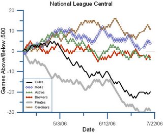
 We're visual people. One of the things that we do best is to look at data and find patterns that we didn't necessarily expect to see. And for a long time, people have known that it's often easier to see those patterns if the data is presented visually.
 One of the areas that present tons of data that are kind of enjoyable to look at is baseball. Even in ye olden days, every batter had a dozen stats (HR, avg, slugging, SB, hits, runs, RBI, W, ERA, K), and thankfully, a bunch of websites have begun to find ways to present this data graphically instead of just running all the numbers in huge, long charts. (Not that a website with the stats for every baseball player in history is a bad thing, you understand.)
First up, there's the Hardball Times whose site presents graphs showing timelines of the division races. They're the source of the graphic I've presented above. It's a great way to look at, for example, the NL Central and see just when it was that the Reds hit a rough patch. My honest guess is that the blue line won't be getting closer to the brown line anytime soon.
 There's also fangraphs.com that has really been at the forefront of finding effective visual ways to present baseball numbers. They're developed a graph called the win probability graph showing how each and every event - every hit, every strikeout - changed the chances that each team would win the game.
On the graph on the left, for example, you can see that in the Reds-Rockies game from July 16th that it was Rich Aurilia's single in the eighth that really made the difference, taking the game from a 70% for the Rockies to a 90% win for the Reds with one swing. Fangraphs also has some great graphs allowing you to look at individual players and check out how their tendencies (grounders vs fylballs, power vs speed, etc) have changed over their career. You could look at, for example, what's wrong with Mark Teixeira.
 Finally there's BaseballGraphs.com that presents loads of data - including the 1990 season summarized. Here you can see that based on runs scored and runs allowed, the Reds were probably the second best team in the NL in 1990 (their last worls series title year). The Mets' stats predicted that they'd be over .600, but they ended up seven games below that predicted record.
And it looks like the Reds were doing it with pitching, rating high on the vertical scale (low ERA = higher) and left on the horizontal (high runs scored = far right).
Of course it doesn't matter because a flag flies forever.
All of this is relevant because I'm heading to Detroit today to check out a game in Comerica. We'll be in the first row over the wall in the very left-most corner - section 144.
Enjoy the day, folks...

1 comment:
The park wasn't bad...wasn't great either...seats were angled toward whatever wall you were by which meant you had to turn toward home plate...that's something that GAB at least got right...
and I am, as always, eager to hear about P4P...gimme an email, man...
Post a Comment