
Websites are meant to communicate information.
They do this marvelously well, even if it's not the information you might be meaning to communicate. Take, for today's example, the website for the City View Tavern. The Tavern is a place I want to try because it's the second-ranked burger from Cincinnati magazine, and it's supposed to have a great view of the city (this Sunday's trip was postponed as we realized Mount Adams would be a zoo before the fireworks.
Their website is a spectacular example of mystery meat navigation. There no instructions, no directions, no guidance on the page. When you first load the page, you're greeted with the following page...

I'll give them credit that the facebook and twitter icons are prominently and clearly presented, but it took me about a minute to realize that the blinking neon sign over the door was what I needed to click on to find any information. Once I did click, I got...

All I was looking for was a copy of the menu and the hours. Let's see, would that be under the bar, the deck, front room?
Oh, and I'm getting annoyed because the cursor turns into a buzzing insect on the site. Because we all know that the image you want to present of your restaurant is that it has flies.

Clicking on the hallway, front room, or the deck present me with no information at all, just a changed image with some hidden clickable spots within. If you stupidly click on those spots, you get another window opened showing a slide show of the view from the tavern's deck. You're not warned in any way that you'll be sent away or will get a slide show. No, no reason to tell people what's there. Clearly you don't want to inform your possible customers. Instead, you want to show that you're quirky and creative and can pay somebody to design a flashy (and flash-based) website. That'll do a great job keeping your people engaged in your useless frickin' website.
If you're lucky enough to click on The Bar, you're greeted with three options...

Hours?!?!? Finally, something useful. Let's click there.

When the hell do you close?
And when the hell do winter hours start? I get it that summer hours start 3/21, but when do summer hours end?
Jesus, are you people trying to annoy everybody even when they screw up and almost find something useful on your site?
If, instead, you click on View Food thinking you'll get to, oh I don't know,VIEW FOOD, you'll be surprised to find out that you get to view a very, very partial menu.

And the menu doesn't even all show up. Turns out that there's more menu if you drag the image upward. There's almost nothing to suggest that you should do that, however, as there's no scroll bar over on the right-hand side where everybody in the world puts them to show that there's more to the page.
If you're stupid enough to click on The Burger and the Bloody thinking that perhaps it might talk about their burgers and maybe drinks, you get another pop-up window with more mystery meat craptacular navigation.

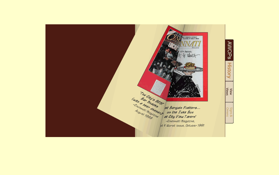
'Cause AWOP is an acronym that everybody understands...as is Signs and Omens. Sure, we all know how useful those are when you're trying to learn about a restaurant. Do they have signs and omens and AWOPs? Hell, yes, I'm there.
To make things even more fun, it's hard to find the small spot in the bottom right corner that allows you to 'turn the page' to get any information on these pages.
If, somehow, you screw up and actually find Directions (hidden under etc because it's just extra information that nobody really needs to know about you), you also get a link that does nothing (Oddities), and one that called LinkS even though is pops up a window with only one link.
And to top it all off, Directions gives you a poorly scanned, low-res image of their directions and map. No possibility of copying and pasting here.

This site is a phenomenally crappy website. It's atrocious. My brain hurts after clicking through its crapness.
Their food better be spectacular because this is a website designed to drive people away.
2 comments:
I can't believe you'd even consider giving that kind of crap your money. Doing that is kinda like encouraging the class clown.
But what if the class clown has the second best burger in town according to Cincinnati magazine?
Post a Comment